Editor’s Note: The views expressed in this commentary are solely those of the writers. CNN is showcasing the work of The Conversation, a collaboration between journalists and academics to provide news analysis and commentary. The content is produced solely by The Conversation.
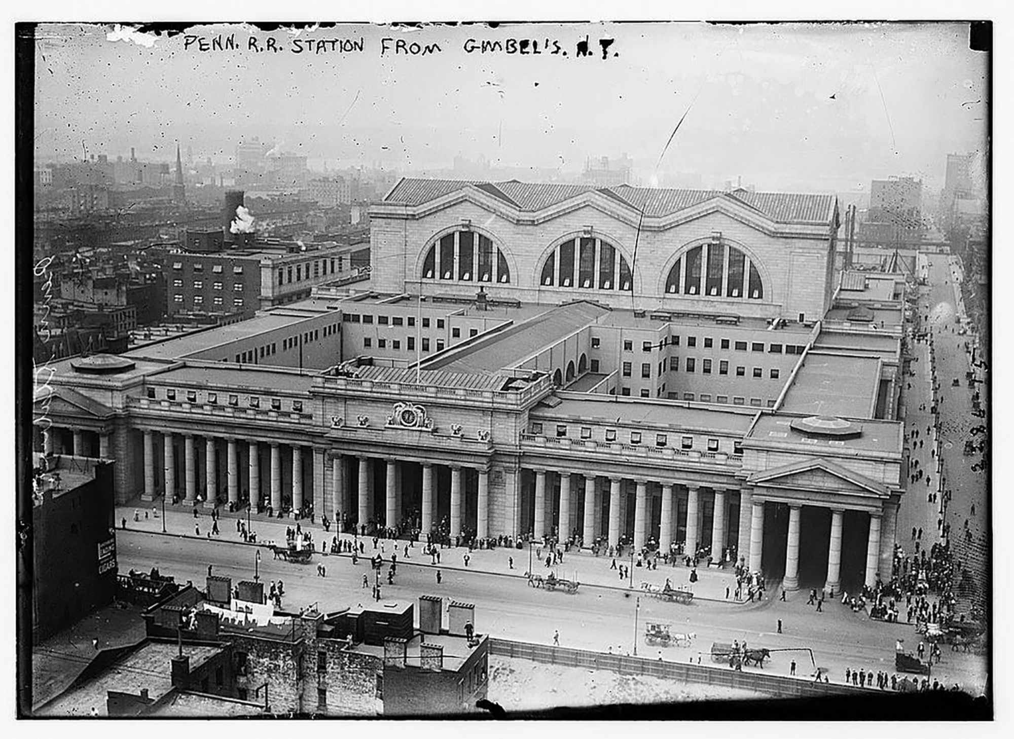
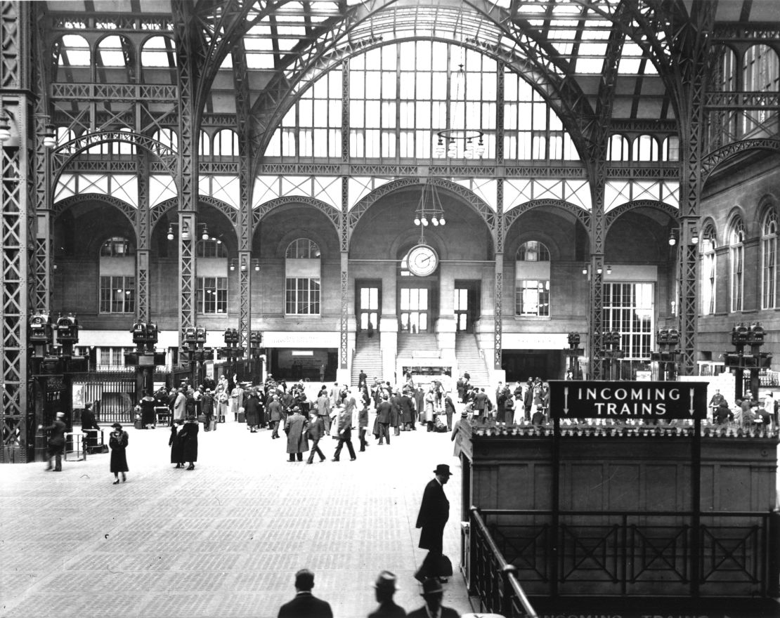
In June 2017, New York Governor Andrew Cuomo announced a $1.6 billion project to transform New York City’s much-maligned Penn Station in hopes of restoring it to its former glory. The original structure – an iconic example of the Beaux-Arts architectural style – was destroyed in 1963 and replaced by a bleak, underground network of tunnels and walkways.
“One entered the city like a god; one scuttles in now like a rat,” architectural historian Vincent Scully Jr. lamented.
If there’s a silver lining, the 1963 demolition did spur the formation of the New York City Landmarks Commission in 1965 and the passage of the National Historic Preservation Act.
Unfortunately, all cannot be salvaged. Preservation efforts must be galvanized; they require mobilization, time and resources. We reached out to five architecture professors and posed the following question: What’s one American structure you wish had been saved?
While their responses vary – from an unassuming home nestled in the suburbs of Boston to a monument of 19th-century wealth and glamour – none of the structures could resist the tides of decay, development and discrimination.
A mecca for black Chicago
Daniel Bluestone, Boston University
In 1943, when the storied, half-century-old Mecca apartment building in Chicago’s South Side was about to be demolished, something extraordinary happened: The Illinois legislature passed a bill to preserve it.
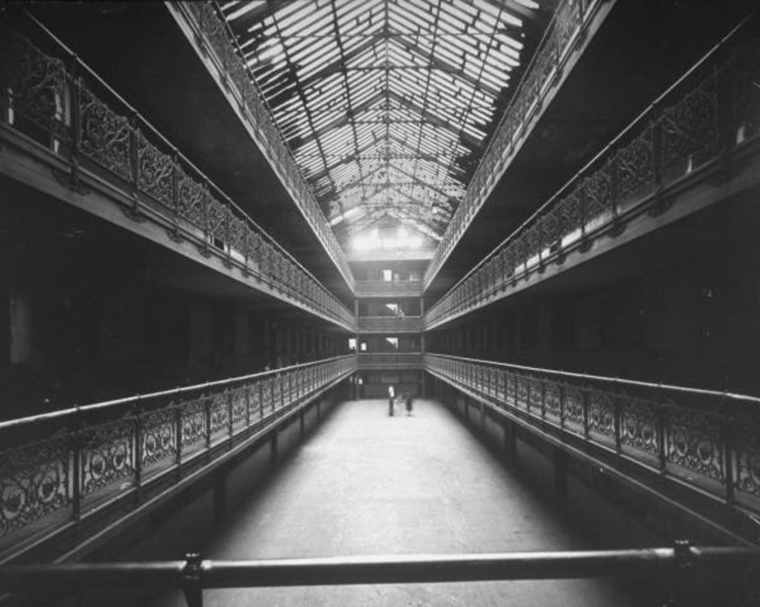
Designed in 1891 by Edbrooke and Burnham, the 96-unit Mecca immediately captured the public’s imagination. It was Chicago’s first residential building with a landscaped courtyard open to the street, a design that fused two seemingly incompatible ideals: to build densely while preserving and cultivating the natural landscape.
In the late 19th century, Chicago’s tenement reformers had demanded more light and fresh air for the city’s apartments; they wanted small parks and playgrounds to be able to dot the city’s swelling neighborhoods. The Mecca’s innovative design was a paean to these progressive concerns.
The complex had two atria with skylights that flooded the interior with light. Residents accessed their apartments via open galleries that encircled the atria, with railings that featured foliated ironwork. This form – the courtyard within an apartment complex – inspired a hugely popular Chicago vernacular tradition.
In the early 20th century, the Mecca was enveloped by the South Side’s expanding Black Belt. Between 1912 and 1913, the complex’s occupancy changed from overwhelmingly white to completely African-American. The massing of black residents in the iconic building inspired residents and artists to view the building as an symbol of black Chicago. South Side blues bars improvised the “Mecca Flat Blues,” which were tales of love and heartbreak, while poet Gwendolyn Brooks memorialized the building with her poem “In the Mecca.”
By the 1930s, officials at the adjacent Armour Institute (later Illinois Institute of Technology) grew concerned about their ability to attract students and faculty to a campus located in the heart of the black community. In 1938 they bought the Mecca, planning to swiftly demolish it in order to create a buffer between town and gown.
Illinois Governor Dwight Green vetoed the legislation that would have preserved the Mecca, and in 1952 – after years of legal wrangling and community protest – the courts allowed the demolition of an architectural and cultural icon to proceed.
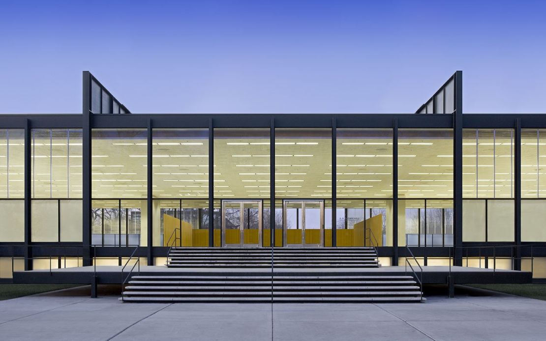
The only consolation is that it was replaced by Mies van der Rohe’s famed Crown Hall, now home to IIT’s architecture school.
A Fifth Avenue palace
Carol A. Willis, Columbia University and Founding Director, The Skyscraper Museum
Many New Yorkers are familiar with the iconic Waldorf Astoria, which sits on Park Avenue. But they might be surprised to learn that this is the second iteration of the luxury hotel. The original was located along Manhattan’s fashionable Fifth Avenue, and the structure took up the entire block between 33rd and 34th streets.
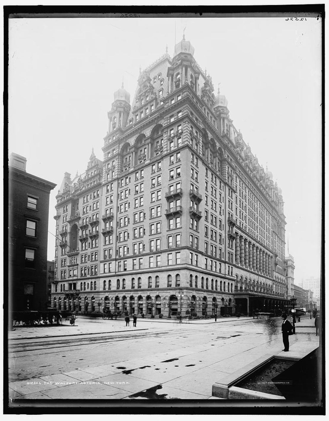
But in late November 1929 – after the stock market had crashed and the slow slide into the Great Depression began – workers began demolishing it.
Designed by the noted architect Henry Hardenbergh, the imposing building had been built in two parts, campaigns that reflected the progress of modern construction technology and a “bigger and better” mantra of American architecture.
The first building, the Waldorf, was an 11-story structure that opened in 1893. It was built on the site of the mansion where Mrs. Caroline Astor had entertained New York’s “Four Hundred,” an exclusive group of New York’s social elite. In addition to 530 rooms, the Waldorf offered stately apartments on the second floor and a majestic ballroom that could be closed off for lavish private events.
The buildings that transformed NYC's skyline
In 1897, the deluxe Astoria section of the hotel was completed. Facing 34th Street, its 16 stories employed a steel skeleton structure – at the time, a cutting-edge technique – that allowed for taller buildings.
With 1,300 rooms, it was the largest hotel in the city, and like many high-class “palace hotels” of the period, the Waldorf Astoria housed permanent and transient patrons; as The New York Times noted in 1890, they were designed “to provide a series of magnificent homes for wealthy New Yorkers as an economical alternative to maintaining private mansions.”
By 1929, however, the owners of the Waldorf Astoria decided to decamp to Park Avenue, where they erected an equally lavish modern, Art Deco monument.
The demolition of the old hotel, completed by the winter of 1930, made way for the construction of the ultimate expression of the city’s architectural ambitions: the Empire State Building.
Traditional New England goes modern
Kevin D. Murphy, Vanderbilt University
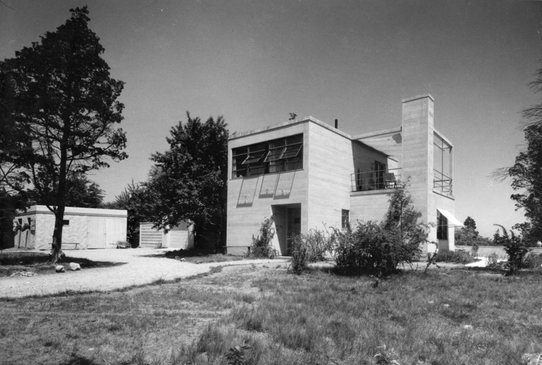
Preservationists are still waiting for something positive to come from the demolition of the house that architect Eleanor Raymond designed for her sister Rachel. Today, photographs are all that remain of the pioneering, modernist Rachel Raymond House, which was built in Belmont, Massachusetts, a suburb of Boston.
Raymond was a graduate of Wellesley College and received her professional training at the Cambridge School of Architecture, an all-women’s design school founded in the early 20th century.
The Rachel Raymond House is important example of how American architects incorporated aspects of European modernism into their own work. Inspired by European luminaries Le Corbusier and Mies van der Rohe, Raymond’s home featured abstract, geometric blocks. She employed flat roofs, metal railings and steel sash windows – modernist elements that were virtually unheard of in early 1930s American homes.
Yet the house is no more.
The Belmont Hill School, a private school for boys, purchased the home and – despite protests from preservationists – demolished it in November 2006. At the time, architecture critic Robert Campbell wrote that it was “considered by many to be the earliest modern dwelling in New England.”
The Rachel Raymond House actually predated another iconic modernist house: the home of émigré architect Walter Gropius, located in nearby Lincoln, Massachusetts. While the Rachel Raymond House was eventually razed, the Gropius House has been preserved as a house museum.
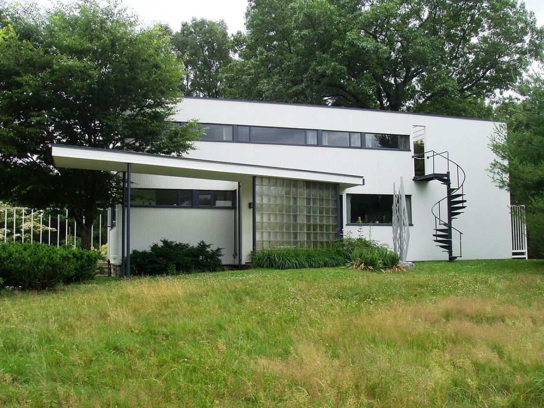
So why did these two important houses received such vastly different treatment?
The obvious answer is that the work of women architects has been consistently undervalued. In her book “Where Are the Woman Architects?,” architectural historian Despina Stratigakos points out that many female architects seem to possess fewer opportunities for advancement than their male counterparts. One source of the problem, according to Stratigakos, is a dearth of prominent female role models in the field.
The Rachel Raymond House could have been a living icon and source of inspiration. Instead, it fell to the wrecking ball.
Paving paradise
Kerry Traynor, University at Buffalo
It might seem odd to lament the loss of a roadway; but Humboldt Parkway wasn’t just a road, it was an urban oasis of green parkland – a crucial component of a much larger park and parkway system.
In 1868, landscape architect Frederick Law Olmsted arrived in Buffalo, New York to design a park for the city.
Instead, he created a Park and Parkway System that consisted of six parks, seven parkways and eight landscaped circles. The brilliance of the plan, however, was in the parkways: over 200 feet wide, lined with elm trees and their canopies, they created a ribbon of green that wove its way through the city, connecting its parks and neighborhoods. Humboldt Parkway connected Delaware Park – Olmsted’s largest – with Humboldt Park.
The result: a city within a park, not just parks within a city.
But with calls for urban renewal in the 1950s and a growing dependence on the automobile, the city no longer saw the pastoral quality of Humboldt Parkway as an asset.
To city and state planners, Humboldt Parkway was the ideal location for an expressway – a highway that could carry automobiles to and from the suburbs and the downtown core, while relieving congestion on neighborhood streets.
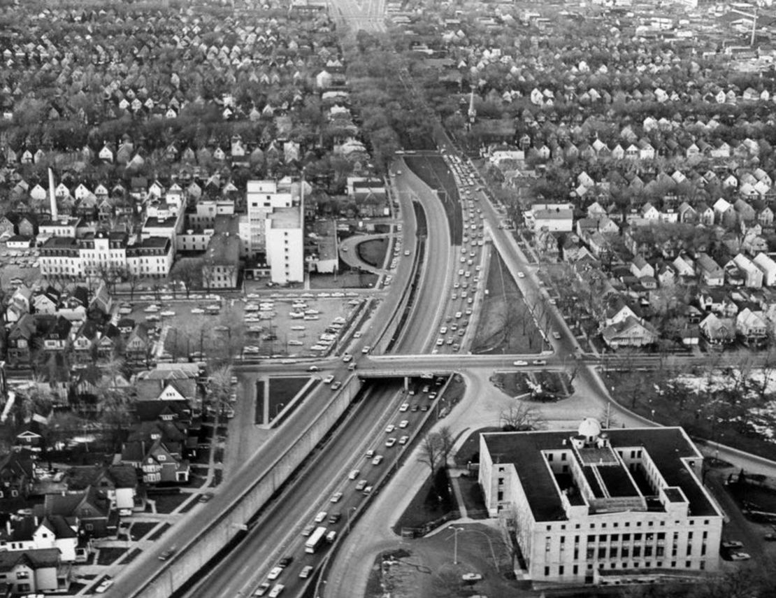
In order to clear the way for the new highway – dubbed the Kensington Expressway – the state cut down trees, tore up the parkway and demolished homes. The new highway displaced families, divided neighborhoods by race and income and caused property values to plummet. As neighborhoods fell apart, businesses shuttered their doors.
Olmsted’s parkway had, quite literally, been paved over. As Joni Mitchell sings in her hit song “Big Yellow Taxi,” “They paved paradise / And put up a parking lot.”
From the rubble, a preservation movement is born
Sally Levine, Case Western Reserve University
When I moved to Chicago in 1982, the Chicago Stock Exchange Building had long disappeared, but people still spoke of it with a hushed reverence.
Not only was it considered one of the finest accomplishments of architects Louis Sullivan and Dankmar Adler, its demise also indirectly led to the tragic death of architectural photographer and preservation activist Richard Nickel, who lost his life snapping photographs of the structure during its demolition.
Built in 1893, the 13-story structure housed the stock exchange for just 14 years. Subsequently the building had a variety of tenants, but leases became fewer and farther between, until the City Council approved its demolition in 1972.
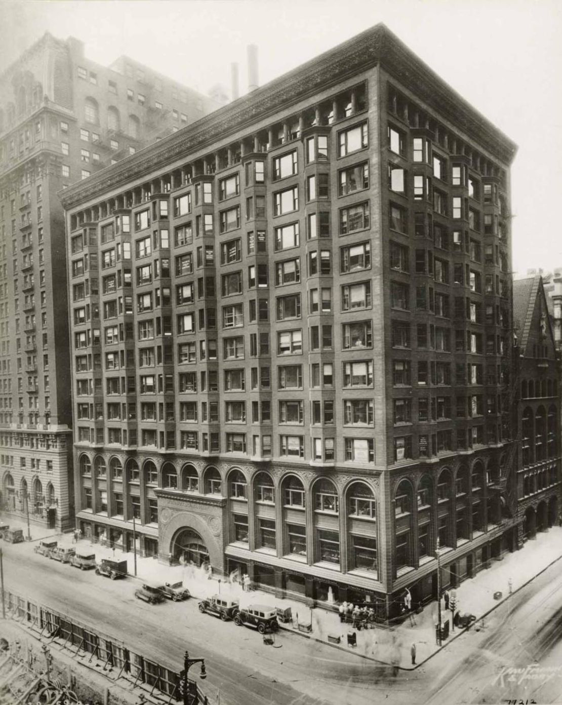
But in its heyday, it was magnificent.
Reflecting Sullivan’s famous phrase “form ever follows function,” the facade demarcated the building’s three parts – the base (the stock exchange), the middle levels (offices) and top (the building’s “crown”). The base contained an exquisite two-story-high trading room. The nine stories of offices were notable for their columns of bay windows and Chicago windows (composed of a large fixed window flanked by operable ones), and the building was adorned with a row of recessed windows and a distinctive cornice.
But perhaps the most distinctive aspect of the building was the large arched entry, which represented a major development in Sullivan’s skill. Sullivan also adorned the stock exchange room with breathtaking low-relief ornaments and brilliantly painted stenciled patterns.
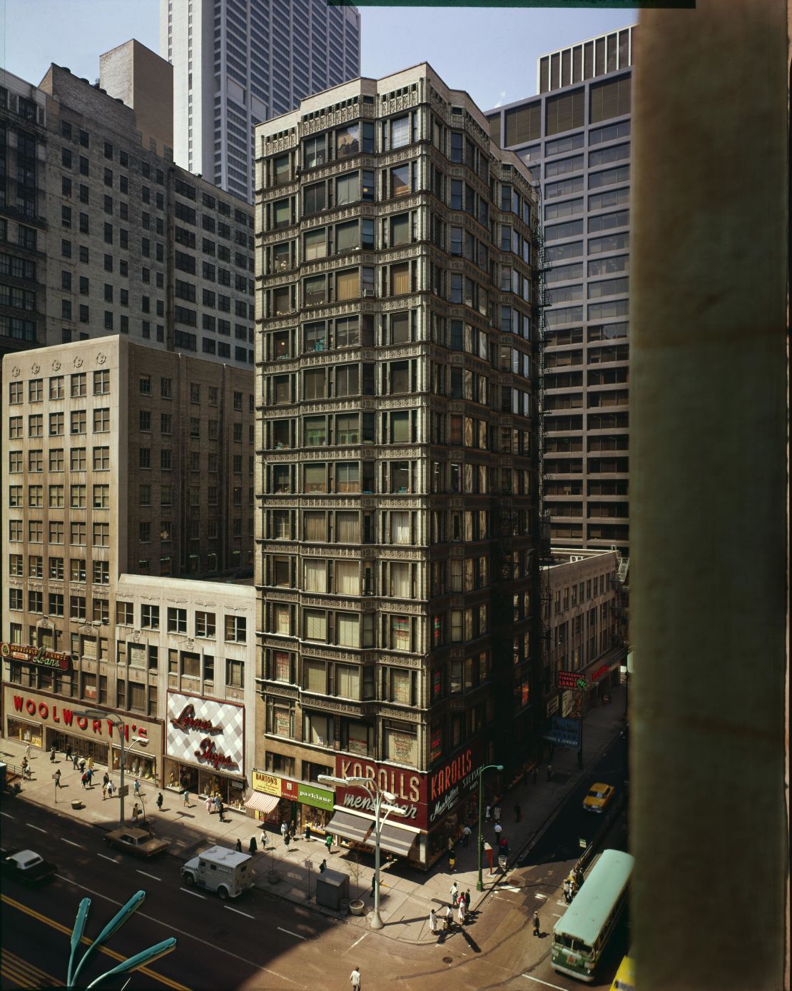
Many consider its demolition the impetus for Chicago’s preservation movement. Another important Chicago architectural icon, the Reliance Building, ended up being saved after vigorous efforts by activists. Through the efforts of Nickel and other preservationists, the arched entry and the interior of the trading room were saved – both are now owned by the Art Institute of Chicago. The arch sits at the corner of Monroe Street and Columbus Drive next to the museum, and the trading room has been reconstructed within the museum itself.
While not as satisfying as seeing the actual building, these remnants testify to the beauty of the Chicago Stock Exchange Building – and the importance of preservation efforts.
Republished under a Creative Commons license from The Conversation.

